Print Finishing Options – what are your choices?

Print Finishing Techniques to enhance your brochure

What are you doing to ensure that your printed leaflet or brochure is effective in this digital age ?

Your first step is understanding the different print finishing techniques for your Leaflets, Brochure, or Posters will help you to make the right decision, as the quality is paramount.

Selecting the most suitable print finishes will enhance the design of your brochures  and will will make a lasting impression on your customers. It will showcase your products, and may a customer more likely to buy from you.

Millfield Media have been in the industry for 30 years so we can help you to get a professional product within your budget.

It is so important that your brochure not only looks good but also feels good as well. Some of the best finishes are available and we can help you to decide which finish is suitable for your brand.

We will ensure the finished product is the right choice for your brand, it fits into your budget,  and helps your business stand out for all the right reasons.

Although the options depend on your budget and how you would like to showcase your brand, there are solutions for this.

This is where a print specialist can advise and guide how to get a professional finish within your budget,

Print finishing options – what are the choices ?

Lamination is the most common finishing technique.  Applying a thin layer of plastic to paper or card sheets to enhance and protect the printed material from moisture, staining, smudges or tears.

Popular types of laminate are soft touch, gloss, matt and silk which makes it excellent for durability and enhances the vibrancy of the ink colours.

Spot UV Varnish is a liquid coating that is applied to the surface of a sheet (available in Gloss, Matt and Silk finishes) which is then dried / cured under an ultra violet light. Its ideal to be a little different and is a good talking point.

Embossing is where an embossed pattern is raised against the background, while a debossed pattern is sunken into the surface of the material

Foil Blocking is specialised process of applying metallic or pigment foil to paper or card, where a heated die is stamped onto the foil. This technique is superb to add elegance, distinction and hand finished luxury to a brand.

Binding is a term which describes gathering and fastening together separate sheets. Primarily used for the creation of books, brochures or leaflets.

This could be saddle stitch, wire binding, perfect binding, ring or spiral binding and trimming. Cutting your printed material to its required size using crop marks

Die-Cutting – is where various shapes are cut out of the stock, and used to create packaging, greetings cards and folders.

Perfect Bound is ideal for a multi page brochure or booklet. It is where the pages and cover are glued together at the spine with a strong but extremely flexible glue.

The remaining sides of the book are trimmed as needed to give them clean “perfect” edges.

Saddle Stitched is where multiple pages of at least 8 pages or larger are bound together along the fold and finished with 2 staples.

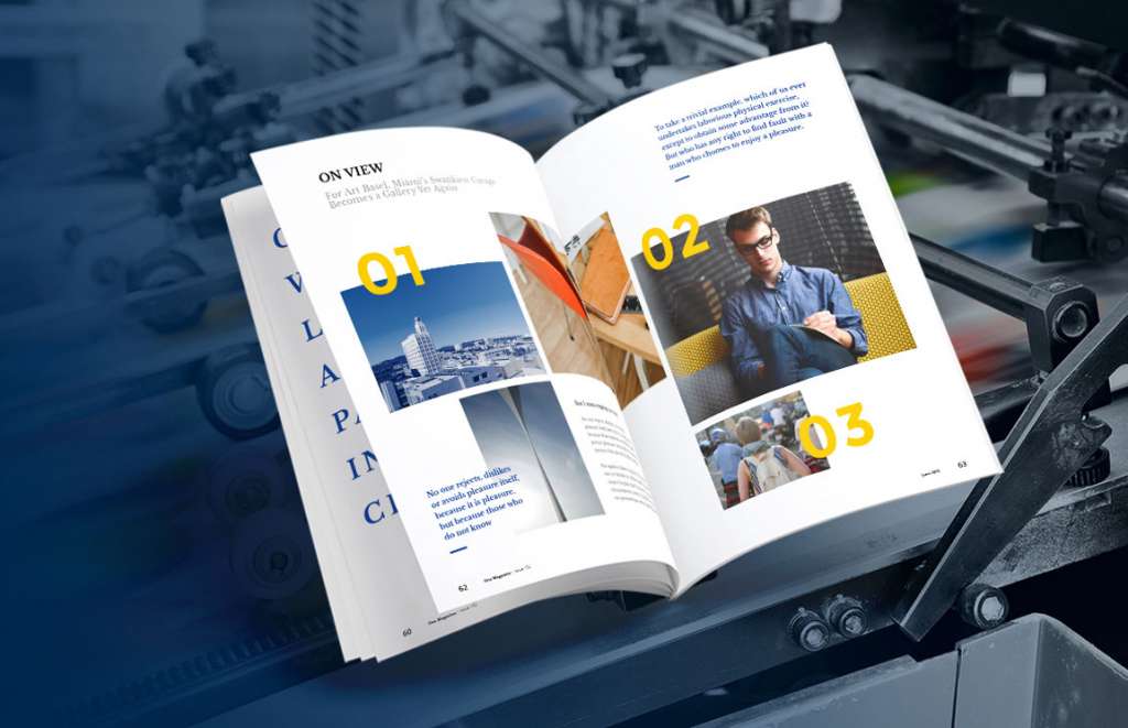
Leaflets and Brochures – Stand out with a good finish 

Remember you’re objective is to sell a product or service so you’re trying to ensure that your customer will want to buy from your business.

Choosing your finish is imperative if you are designing a business brochure, catalogue or leaflet.

Read our Tips for designing a brochure

A printed finish is probably the most important decision you will make other than design.

When it comes to finishing the requirements of your printed leaflet or brochure you need to also  be sure to consider the weight of paper on the inside as well as the cover.

GSM paper quality and weight known is in the trade as  ‘Grams per Square Meter‘.

This basically means what paper quality you are getting for your money.  The higher the GSM the heavier the paper.

We would advise a heavier paper for the front and back covers.

A professional quality finish makes all the difference when people are handing brochures and first impressions are so important

Choosing the type of finish is probably the most important decision you will make other than design.

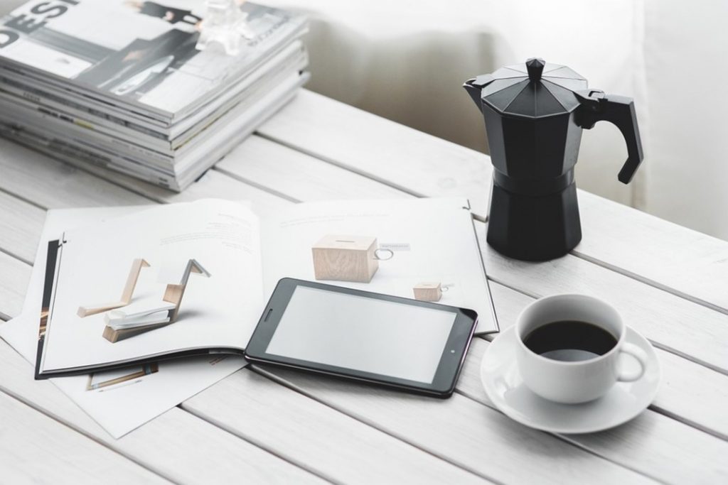
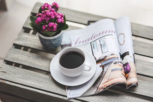
Customers like to feel good quality paper.they like the feel of things !

“Print is tangible – the better the quality the more likely they will keep it rather than  throwing it in the bin”

If you try to be flimsy and cheap this will give out the wrong message to your potential customers. So in our view worth the extra spend.

Dont spend a lot of money on designing your brochure or leaflet and then try and skimp and save money on your printed product. 

The next important decision to make is  the right paper weight. It will add value to the service or goods that you are selling.

Opt for a nice coated finish. if you get the quality right you will get a better return on your investment.

If we can help you at Millfield Media with any advice guidance  please dont hesitate to contact us.

If you would like to order a free sample pack to understand the different finishes and paper quality please follow the link and fill in your details

Ask about the options available for your brand, or a quote please  contact me for details nicola-millfieldmedia@outlook.com

How to create Print ready artwork – Guidelines and Tips

Print Ready Guidelines Tips and Tricks

What is print ready I hear you say…..

Print Ready is the term used in the trade to describe a document or file that is ready to proceed to print

In the print industry there are certain specifications that help us produce a high-resolution printed outcome. 

Part of this specification is that the artwork needs to be supplied with crop marks added to each corner and set with a 3mm bleed to each edge.

This ‘bleed’ edge will be trimmed off in production but it is necessary as any colour or images need to ‘bleed’ over the finished size so that you get a nice clean edge (no paper showing on the edge).

If bleeds are not included then to mimic the appearance of the bleed, we have to cut into the edge of the document.

You’ll end up with a printed document which is 4 or 5mm narrower and shorter than you intended.

Which may result in critical content being cut off or the finished job looking uneven/off-centre once cut.

You may have  some text very close to the edge of the page so these may be completely cropped off.

So for this reason we recommend keeping all text, logos etc inside the ‘safe area’ to avoid any possible cutting issues.

There’s inevitable movement with print in the cutting process and if you have text too close to the finished size line it may be cropped.

We advise you to set the safe area 5mm in from the finished size line.

Standard method in the industry is PDF for submitting artwork for printing.

This is because PDF generates smaller files and, when used correctly, it ensures that all graphics/fonts are properly embedded and therefore there is no movement.

Enabling them to be printed correctly,  no matter which computer you print them from and is ideal if you are creating a multi-page.

FONTS 

Check and try where possible to stick to standard fonts such as Arial or Times New Roman, as these are usually installed on nearly every PC.

We understand that you may want to be different if it is part of your brand identity and choose an unusual font.

If this is  this case for your brand, all we ask is that you remember to tell the designer or printer.

Changes that may be needed by your  printer or designer will have to be done in this font and therefore downloaded to re-create or change your artwork for you.

Ideally, all fonts in print ready artwork should be converted to outlines to avoid any potential font embedding issues.

Choose the highest available quality setting, look for “print quality”, “press quality” or “high quality”.

COLOURS

To get the best colour match we require artwork to be set as the CMYK colour model which is a four colour process used in colour printing and used to describe the printing process itself (Cian Magenta Yellow and Key which is black). 

See our blog on Digital and Lithographic printing explained regarding colours 

The colours of your artwork will always look brighter and richer on your screen or monitor as it’s a back lit screen and those colours are made up of three colours – Red, Green and Blue (RGB)

They will will always be slightly darker than how it appears on a computer because the colour is reproduced from four colours.

Standard print(CMYK) then printed onto paper or board (which can also affect colour) then left to soak into the stock and dry.

When colour printing please remember to specify colours by indicating the Pantone name or number.

This assures that you get the right colour when the file is printed, even though the colour may not look right when displayed on your monitor, the printed article will.

Remember too how important it is for top quality images if you are looking at wide format printing such as outdoor banners or pop up banners.

Decide on the size of your banner. the images need to be at least 300dpi (dots per inch) preferably bigger if possible to ensure they are crisp and dont blur or pixilate.

Making sure they are saved in the correct colours CMYK.

PDF is now the industry standard method for submitting artwork for printing, because it generates smaller files

When used correctly, it ensures that all graphics and fonts are properly embedded to guarantee that they will print correctly no matter which computer you use.

If your PDF is password protected we won´t be able to print it. Please ensure all document restrictions are removed.

To remove document restrictions, bring up the document properties (File – Properties or Ctrl+D), click on the Security tab and ensure that all actions are set to ´allowed´.

It is so important to get your artwork correct so that when you are preparing your business cards, flyers, brochures and leaflets.

They will look so much more professional and set your brand off.

Read our other blog Brochure and Leaflet Design Tips to help you also

We hope this information is helpful if we can be of any further help or you would like a quotation please  contact me

Brochure Printing and Design Tips

Brochure and Leaflet Design and Printing tips

Remember, your brochure could be one of your bestselling marketing tools so it must grab your customer’s attention, so this is fundamental to your brand

There are so many options available. The first step is choosing what sort of leaflet or brochure your business needs and what you want it to say about your products or brand.

We suggest you concentrate on key messages or services , decide what you are wanting to say or sell. Keep it simple but try to be different from all the others that are posted though your customers door.

Then it is about getting your leaflet design right. You could use the skill and flair from a graphic designer who will be able to advise and guide you.

We will sit down with you to understand your brand, what your key messages are and the tone of voice you use as a business.

It would be sensible to see their work for other brands they have worked with.

Our suggestion would be to throw some ideas round together perhaps using mood boards, brainstorming with other team members of your team to discuss what your business needs are.

That said, you don’t want to go to the trouble of spending a lot of time and money in designing your brochure only to get it wrong at the printing stage, which is why we suggest you follow our step by step guide. Brochure printers may not have a designer attached to them, choosing a Print and Design business is a win win situation, they can advise on paper quality and what will work. Therefore keeping your cost down, but the quality wont be compromised.

Brochures that speak for themselves

BROCHURE DESIGN TIPS

Decide who your target audience is

  • Decide what your objectives are and what you are trying to achieve
  • Who is your target audience and what are you selling?
  • The above will help you determine whether you need a brochure, booklet, flyer or tri-fold leaflet?
  • Decide what size you think it should be A4 A5, choose either portrait or landscape and how many pages? (remember printers need it to be a multiple of 4)
  • Choosing the right paper weight, quality and finish is just as important as the design itself. It will add value to the service or goods that you are selling.
  • Have you got your brand pantone colours and codes ?

WHY CHOOSE PROFESSIONAL PHOTOS FOR YOUR BROCHURE

Invest in beautiful images and photographs and go for gloss to showcase them

Your images in our opinion should be professional done to enhance your brochure as they need to be a high resolution. This way they are your own and therefore not governed by copyright.

One thing to stress is you cannot compromise when it comes to good quality images. Don’t make the mistake of using low-res images as these will print look unprofessional.

If you are you selling a product that needs the colours to be really accurate and true to life then take professional photographs to ensure these transfer well to your printed product.

Professional Photographs will be high resolution and will bring your brand to life.

The photos will be exclusive to you and your business and you will have the edge over your competitors.

Alternatively you could use a FREE STOCK IMAGE site such as Pixabay or Freepik.

Decide on the quantity, this will affect the cost. Larger amounts will be done lithographically, smaller amounts will be done digitally. See our article on the difference between Lithographic and Digital printing options,

When do you need them by as this may well affect the cost? Allow plenty to time for changes to text and to copy read for mistakes.

BROCHURE PRINTING TIPS

Remember print is tangible and customers like the feel of things, so if you get the quality right you may get a better return on your investment and therefore sell more products or services.

Will your brochure be folded, collated, stapled or bound and is the cost of this included in the quote ?

The cover of your booklet can make the difference between it being picked up or discarded.

Speak to a print specialist, ask their advice. Then get a quote for a couple of different amounts and finishing options as a price comparison. 

Choosing a more contemporary look for your brochure, then we would recommend a matt lamination.

Now you have a fantastic design we suggest you use a heavier paper which will ensure durability. Choose a really nice coated finish, this could be gloss or silk which could be matt laminated.

Allow time for it to be checked for clarity and for errors by other people in your group.

Pay attention to spelling, numbers etc. Your printer will not be able to do this so this is imperative that it is done by a couple of people as it will be a waste of money if not right.

Make sure the artwork is in the agreed format. This may be JPEG, PDG of PNG.

Finally allow enough time to get it to your printer on time and save yourself and your printer unnecessary stress

Contact us if you would like some advice, guidance or quotes regarding your Brochures or Leaflets, although we are based in Northumberland we do offer our services UK wide with FREE delivery too

Please get in touch Nicola-millfieldmedia@outlook.com