Pantone colour of the year for 2020 is Classic Blue
In their words is a “shade reminiscent of the sky at dusk” (credit to Pantone for the image).
Some designers will be absolutely delighted with this choice, and some businesses will want to ensure they include it in their mix of branding.
However, it is all down to personal choice, it will mix well with other colours so it is a good choice.
Your business card is a talking point and an important stepping stone to a potential client or collaboration.
Whether you are a business owner, an entrepreneur or starting a new job/career it’s a very important choice.
It also depends on the industry you are in and what your brand represents.
Certain colours have significance. You have to remember it’s a first impression of who you are and the brand that you represent.
Colour and texture is a good starting point to ensure you have a talking point that will catch people’s eyes, grab their attention.
Images are equally important to get you noticed, either a ;ogo, photo, or an illustration or design if that’s your line of work.
How many different types of business cards have you had since your career started ?. The question is when was the last time you changed yours and why?
If your card looks just like everyone else’s card, then chances are you have probably failed and you’re in the bin. So, in our opinion it is worth the time and effort.
What does the colours for Business Cards mean ?
White is standard, safe and used by many to fit into their business stationery and is an easy option.
This is fine but to stand out choose a logo and colour for your brand that will distinguish you from all the others in your field.
If you want to make an amazing impression and to stand out with something really special then you need to strengthen your brand credibility ?
Red is bold, daring and exciting so the market leaders that spring to mind are Virgin, Lego, Coca-cola, Nintendo, Red Bull.
Orange is confident, friendly and warm you think Fanta, MasterCard.
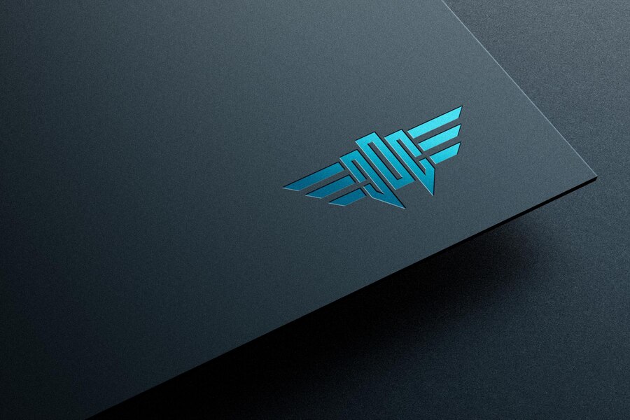
Blue is the signifies reliability, peaceful, confidence, and trust. NHS, Facebook, Twitter, Intel and Skype spring to mind as the leaders in this field also we at Millfield Media have chosen this colour too.
Pink is usually associated with feminine, symbolising sensitivity and love.. Barbie and Victoria´s secret are brands that use pink so they will be delighted at this choice
Yellow is sunshine, bright, happy and cheerful – Mcdonalds, Ikea, Post-it, Shell and Snapchat are a few that have opted for this colour.
Green presents balance, growth and nature. BP, Holiday Inn for example.
Black and White signifies importance. Nike, BMW, Apple, Disney and Harley Davison are the brand leaders in this field.
Purple cards suggest imagination, dreams and spirituality.
People from the holistic sector usually prefer this colour. Cadbury and Hallmark are brands that spring to mind for this colour choice.
Now think about the shape, everyone has a rectangle business card because it is the standard size, why? because they fit into a purse or wallet easily, but you want to be different right ?
Although Standard business card size is usually 85mmx55mm they tend to be a bit cheaper.
Have you thought about about dye cut, square business cards or mini business cards just to be different ?
These will bring a different element to your design,
The shape of your business card should complement your brand.
Every detail from fonts/typography, which includes spacing between letters are an important factor to consider.
Then decide do you go funky, traditional or elegant?
Again, think of the message and your brand and choose wisely to compliment this.
Deciding where you put your logo is crucial
Another element to consider is the white space which is linked to sophistication .. less is more.
Make sure all your contact details are there relaying your key message.
Proof read all the time to check for spelling, phone numbers etc and then save in a format that is compatible for your printer.
Choosing the right colour and combining with a specific paper choice and feel can mean you either stand out from the crowd or your card will just be put in that drawer and forgotten about.
We suggest you go for something different, perhaps a gloss, Spot UV or a decadent Foil finish.
We are happy to take on any project, regardless of size, so whether you need 100 business cards or 10,000 business cards, we will be more than happy to help.
We dont like the phrase cheap business cards because it infers that they are inferior.
All our cards are printed on quality paper at an affordable price so it suits all budgets.
We offer Small Businesses a branding offer. So if you are looking for cost-effective advertising and want to make a excellent first impression with your Business Card then contact us now for a quote
Why not order one of our business cards sample pack to help you decide.
Contact me for a discussion direct on millfieldmedia@outlook.com
To help you to decide we have an amazing FREE sample pack that could help you decide on the paper choice/quality

 Suitable for a wide range of surfaces including paper, card and plastics